Artwork Requirements for Plastic Card Printing: What You Need
Table of Contents []
- Artwork Requirements for Plastic Card Printing with Plastic Card ID
- Card Dimensions and the CR80 Standard
- Resolution, Color Mode, and File Formats
- Color Management for Accurate Results
- Magnetic Stripe, RFID, and Smart Chip Placement Zones
- Common Artwork Mistakes and How to Avoid Them
- Submitting Artwork and Getting Started with Plastic Card ID
Artwork Requirements for Plastic Card Printing with Plastic Card ID
Getting your artwork right the first time isn't just a technicality - it's the difference between cards that look sharp, professional, and exactly as you imagined, versus cards that come back blurry, cropped wrong, or with colors that missed the mark entirely. Artwork requirements for plastic card printing are surprisingly specific, and understanding them before you submit files can save you time, reprints, and frustration.
At Plastic Card ID, we've helped more than 100,000 customers across the United States bring their card programs to life - everything from employee ID badges to hotel key cards to loyalty and membership cards. After decades in this industry and more than 50 million cards shipped, we've seen every kind of file submission imaginable. This guide covers everything you need to know to prepare artwork that prints beautifully on plastic.
| Specification | Requirement | Notes |
|---|---|---|
| Card Size (CR80) | 3.375" x 2.125" | ISO 7810 standard |
| Resolution | 300 DPI minimum | At final print size |
| Bleed | 1/8" on all sides | Prevents white edges |
| Safe Zone | 1/8" from trim edge | Keep text and logos inside |
| Color Mode | CMYK | Convert RGB before submission |
| Preferred File Types | PDF, AI, EPS, TIFF | Fonts embedded or outlined |
Card Dimensions and the CR80 Standard
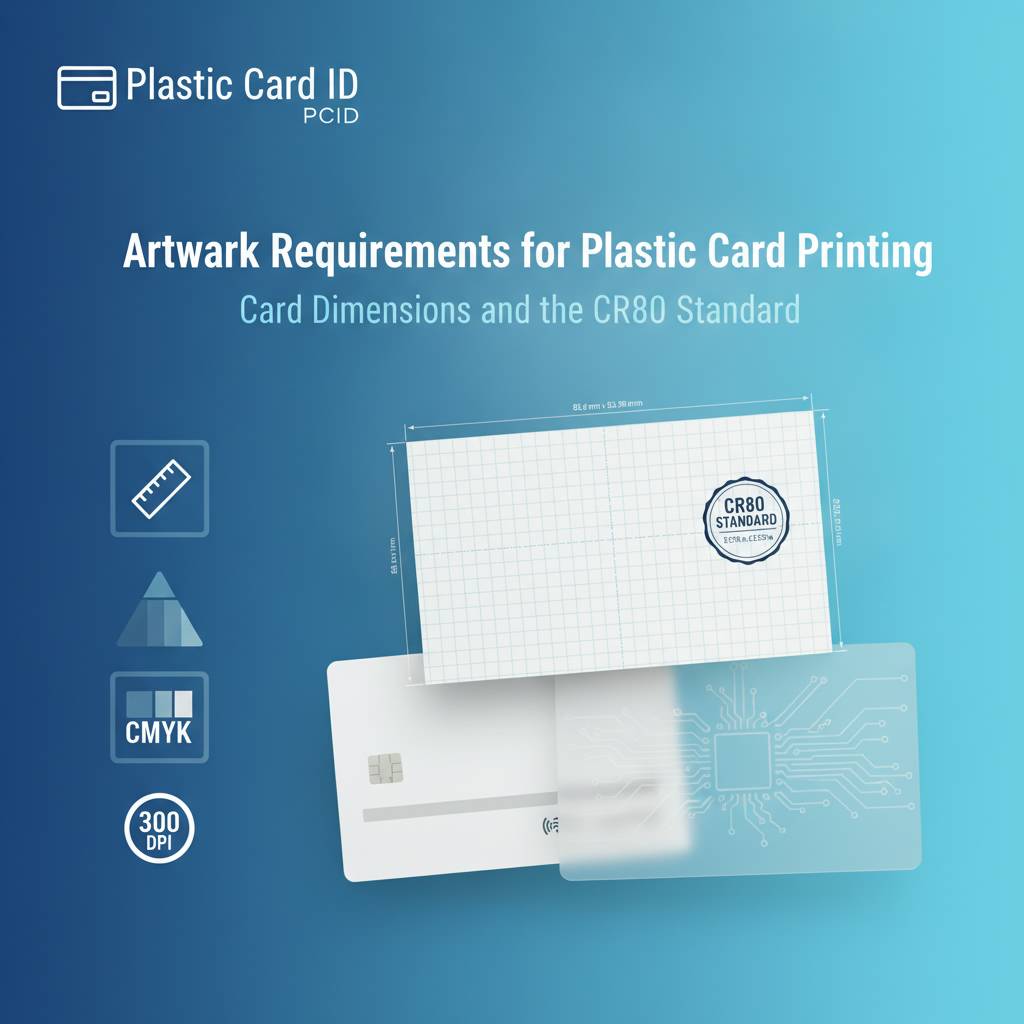 The CR80 is the foundation of virtually every plastic card program in the United States. At 3.375 inches wide by 2.125 inches tall and 30 mil thick, it's the same size as a standard credit card - familiar in every wallet, every badge holder, every card slot. If you've ever pulled out a loyalty card, a hotel room key, or a photo ID, you've held a CR80. That dimensional standardization isn't an accident; it's what allows cards to work seamlessly with printers, readers, lanyards, and holders universally.
When you set up your artwork file, always start with the correct canvas size. Many design errors begin simply because someone built artwork at the wrong dimensions - or worse, at the right dimensions but in pixels rather than inches. Set your document to 3.375" x 2.125" at 300 DPI from the very beginning, not as an afterthought when you're about to export.
Setting Up Your Document Correctly
Open your design application - Adobe Illustrator, InDesign, Photoshop, or a comparable professional tool - and create a new document at exactly 3.375" x 2.125". Do this before placing a single element. Starting from the correct base eliminates the most common sizing errors we see. If you're designing in Photoshop specifically, work at 300 DPI with color mode set to CMYK from the outset.
Add guides at 1/8" (0.125") from each edge for your bleed line, and another set of guides 1/8" inward from the trim edge for your safe zone. Background colors and images should extend to the bleed line. Text, logos, barcodes, and any element you don't want cut should stay within the safe zone. This three-zone structure - bleed, trim, safe - is the backbone of print-ready card artwork.
Bleed and Safe Zone Explained
Bleed exists because cutting is never perfectly precise down to the millimeter. Cards are printed and then die-cut, and even with industrial equipment, there's a small tolerance in the cut position. Without bleed, a tiny shift in the cut can produce a thin white edge along one side of your card - an immediately noticeable defect that signals amateur printing. Extending your background artwork 1/8" beyond the trim edge on all sides ensures that any minor cut variation is invisible.
The safe zone is the inverse concern. If critical design elements like your business name, logo, or contact information sit too close to the card edge, a slight cut shift could slice right through them. Keeping everything important at least 1/8" inside the trim edge means your content is protected regardless of where exactly the cut lands. Think of it as a buffer that guards your most important information.
Card Size Variations Beyond CR80
While the CR80 is the dominant format, CPE also works with other card formats for clients who need something different. CR79 cards are slightly smaller - designed specifically for cards that are to be overlaminated, where the extra laminate thickness brings the final card to CR80 dimensions. CR80 30 mil is standard, but 20 mil thinner cards exist for certain applications as well.
Custom die-cut card shapes are an entirely different conversation - shapes that don't conform to the rectangle at all. These require custom-built templates specific to the die being used, and artwork must be set up against that template precisely. Reach out before building artwork for non-standard sizes so we can provide the correct template to begin with.
Resolution, Color Mode, and File Formats
Resolution is one of the most misunderstood aspects of artwork preparation. A file that looks perfectly sharp on your monitor may print soft or pixelated because screens display at 72-96 DPI while print requires 300 DPI at the actual output size. The distinction matters enormously when you're producing a card that people will hold inches from their face and scrutinize.
Color mode is equally critical, and it's a common source of color shift surprises. Monitors emit light and display color in RGB - red, green, blue. Printers lay down ink in CMYK - cyan, magenta, yellow, and black. When an RGB file is converted to CMYK at the press, colors can shift in ways that are subtle or dramatic depending on the hues involved. Vibrant blues, bright greens, and saturated oranges are particularly prone to shifting. Submit your files in CMYK and you stay in control of how colors translate.
Resolution Requirements in Practice
The 300 DPI rule applies at final print size. An image that is 300 DPI at 6 inches wide but being placed at 3 inches wide in your layout is effectively 600 DPI - more than sufficient. An image that is 300 DPI at 1 inch but stretched to fill the entire card face is effectively 90 DPI - and it will look terrible. Always check the effective resolution of placed images at the size they appear in your layout, not the native resolution of the original file.
For logos and graphic elements, vector artwork is the ideal solution entirely - vectors are mathematically defined and infinitely scalable with zero resolution loss. If your logo exists only as a raster (JPG, PNG, GIF), try to obtain or recreate it as a vector (AI, EPS, SVG) before including it in your card artwork. CPE can often advise on this if you're uncertain about your logo files.
Preferred File Formats and Why They Matter
PDF files built from professional design applications are the gold standard for print submission. A properly exported print-ready PDF embeds fonts, preserves vector data, maintains CMYK color values, and includes crop marks and bleed information all in one contained file. It's portable, reliable, and widely compatible with prepress workflows. This is the format we recommend most strongly for final artwork submission.
Adobe Illustrator (AI) and EPS files are also excellent, particularly for artwork with substantial vector content. TIFF files work well for raster-heavy compositions, provided resolution is correct and color mode is CMYK. JPG and PNG files are acceptable for proofing and review but are generally not ideal as final print files - they compress data in ways that can introduce subtle artifacts, and JPGs do not support transparent backgrounds.
Fonts and Typography Considerations
Fonts are one of the sneakiest problem areas in artwork submission. When a printer's system opens your file, it may not have the same fonts installed that you used in your design. The result can be font substitution - your carefully chosen typeface replaced by something generic and wrong. Always outline or embed your fonts before submitting artwork. In Adobe Illustrator, this means selecting all text and choosing Type > Create Outlines, converting text to vector shapes that require no font installation to render correctly.
For card text specifically, avoid fonts smaller than 6 points if possible. Very small text on a card can become illegible after printing, especially if it contains thin strokes. Bold or semi-bold weights generally hold up better at small sizes. If your card design requires a lot of information in a small space, consider whether a slightly larger card format or a different layout approach might serve your program better before committing to a print run.
Color Management for Accurate Results
 Color matching on plastic cards involves more variables than most clients expect. The substrate, the printing process, the card printer or offset press, environmental conditions during production - all of these influence final color output. Absolute color precision is achievable, but it requires deliberate preparation on the artwork side. Submitting CMYK files with explicit color values is the first and most important step.
If your brand has official Pantone colors, translate them to their CMYK equivalents using the Pantone color bridge or your design application's color libraries. Document those CMYK values clearly - for example, C:100 M:50 Y:0 K:0 for a rich blue - and include that information with your artwork submission. This gives the production team a precise target rather than interpreting color from a monitor view.
Understanding CMYK Color Builds
Rich black - the deep, dense black that looks best on printed backgrounds - is achieved by combining multiple ink channels rather than using K (black) alone. A common rich black build is C:60 M:40 Y:40 K:100. Pure K:100 black can appear slightly washed out or grayish in large areas, especially on glossy plastic surfaces. For text, K:100 is actually preferable because it prevents the slight misregistration that multi-channel blacks can show at small sizes.
Avoid using total ink coverage (the sum of all four CMYK channels) above 300% in any area of your design. Excessive ink density can cause production issues and surface defects, particularly on plastic card substrates. Most design applications allow you to view total ink density in a soft proof or overprint preview mode. Backgrounds and dark color fills are the areas most likely to exceed safe ink limits.
Special Finishes and How They Affect Artwork
Clear and frosted plastic cards, metallic overlaminates, and spot UV finishes all interact with printed artwork differently than standard white PVC. On clear cards, your design must account for the fact that the card itself has no white background - the transparency of the card stock is part of the visual. Colors appear differently, text may need to be white or outlined, and some design approaches that work beautifully on white stock look unexpected on clear.
If you're ordering specialty cards like metal cards in stainless steel, brass, or gold, artwork considerations shift even more significantly. Metal card surfaces reflect light, interact with engraving or etching, and display color through different processes than dye-sublimation or offset printing. Contact CPE early in the design process for specialty formats so artwork is built for the process from the start, not retrofitted after the fact.
Magnetic Stripe, RFID, and Smart Chip Placement Zones
Functional card features - magnetic stripes, RFID antennas, smart chips, signature panels, and barcodes - all have placement requirements that your artwork must respect. These aren't design preferences; they're technical necessities. Placing artwork over or interfering with these functional zones can render cards that are visually attractive but operationally useless.
HiCo and LoCo magnetic stripe cards have the stripe running across the back of the card within a defined band. The stripe itself is typically black or brown, and while it can be printed over in specific circumstances with certain techniques, generally your back-of-card design should accommodate the stripe's presence visually and not attempt to print over it with critical design elements.
Magnetic Stripe Artwork Zones
The magnetic stripe runs along the top of the card back (when oriented in landscape), occupying a band approximately 0.375" to 0.750" from the top edge. Design your card back artwork so that important visual elements fall below this zone. Backgrounds can continue behind the stripe, but logos, text, and imagery that need to be clearly visible should be positioned in the lower two-thirds of the card back.
Signature panels, where provided, occupy a defined area on the card back as well - typically a white or off-white rectangle in the lower right quadrant. Factor this into your back-of-card layout. If you do not need a signature panel, specify this clearly when ordering so the card is produced to your artwork without a pre-positioned signature zone.
RFID, Proximity, and Smart Chip Considerations
RFID and proximity cards contain internal antenna coils laminated within the card body. These antennas are not visible from the outside, but they define the card's internal structure. From an artwork standpoint, RFID cards print identically to standard PVC cards - the antenna does not require any artwork accommodation because it's entirely internal. Your full bleed, full card design is completely valid on RFID card stock.
Smart chip cards present the gold or silver contact chip pad on the card face, typically positioned in the upper left area. This pad cannot be printed over and must be left clear in your artwork. Most smart chip card templates include the chip pad position as a defined no-print zone. When submitting artwork for smart chip cards including advanced formats like MIFARE DESFire, use our provided template to ensure your design doesn't conflict with chip placement.
Barcode and QR Code Artwork Guidelines
Barcodes and QR codes have specific contrast and size requirements to scan reliably. Always provide barcodes as vector artwork at the final intended print size, not as low-resolution raster images that have been scaled up. The quiet zone - the clear space surrounding a barcode - must be maintained and not infringed upon by other design elements. Even partial violation of the quiet zone can cause scanner failures.
For QR codes, minimum print size is generally 0.8" x 0.8" on card stock for reliable scanning, though larger is always better. High contrast between the code and its background is essential - black on white is the most reliable combination. Avoid placing codes on dark, patterned, or photographic backgrounds. If brand considerations require a non-white background behind a QR code, test extensively before committing to a full production run.
Common Artwork Mistakes and How to Avoid Them
After processing artwork submissions for over 25 years, certain mistakes appear with remarkable regularity. They're rarely the result of carelessness - more often they stem from unfamiliarity with print production specifics. Knowing the most common errors in advance is the simplest way to avoid them entirely.
The following list captures the artwork issues we encounter most frequently, along with the specific consequence of each. Consider this a pre-submission checklist you can run through before sending files to CPE for production.
- Artwork submitted in RGB instead of CMYK: Color values shift during conversion, sometimes dramatically. Blues may become purple, bright greens may mute significantly.
- Images below 300 DPI at print size: Results in soft, blurry, or pixelated print output that cannot be corrected in production.
- Missing bleed: Creates visible white edges along card borders where the cut falls slightly outside the design boundary.
- Live elements inside the safe zone margin: Text, logos, or barcodes too close to the card edge risk being partially cut off.
- Fonts not outlined or embedded: Missing fonts cause type substitution, changing your typography to unintended typefaces.
- Using pure K:100 black for large background areas: Results in a flat, slightly washed-out appearance on glossy plastic surfaces.
- Low-resolution logos pulled from websites: Web graphics are 72-96 DPI, far below the 300 DPI required for print. The results are visibly poor.
- File format submitted as low-quality JPG: JPG compression introduces artifacts that become visible in solid color areas and fine details when printed.
Proofing and Approval Process
Before any card order goes to production, a proof is an essential checkpoint. A digital proof shows your artwork as it will be reproduced, and reviewing it carefully can catch issues that might have slipped through your own review. Check every element on the proof - not just the overall appearance, but individual text accuracy, logo placement, barcode readability, and color accuracy relative to your CMYK values.
If you have very specific color matching requirements, a physical proof prior to full production run may be worth the additional time and cost. Physical proofs on the same substrate as your production cards give you the most accurate preview of the final result. For repeat orders where the design is unchanged from a previously approved run, a new proof may not be necessary - but confirm this with us when placing the order.
Working with Plastic Card ID on Artwork Revisions
We are a partner, not just a printer. When artwork arrives with issues that would affect print quality, our team will communicate them clearly before proceeding to production. We can guide you through correcting specific issues, and for clients who need assistance building card artwork from scratch, we can discuss what support options are available. The goal is always cards that perform exactly as intended.
Call 800.835.7919 to speak directly with a card specialist who can review your artwork situation, answer specific technical questions, and help you prepare files that are production-ready. Whether you're setting up your first card program or optimizing a long-running operation, we're here to help you get it right.
Submitting Artwork and Getting Started with Plastic Card ID
Once your artwork is built to spec - correct dimensions, bleed, CMYK color mode, 300 DPI resolution, outlined fonts, appropriate file format - you're ready for submission. A well-prepared file moves through prepress quickly, minimizes back-and-forth, and gets your cards into production on the fastest possible timeline. Everything covered in this guide exists to serve that outcome.
Plastic Card ID supports card programs of every scale, from 50 cards a month to tens of thousands. Whether you're ordering blank PVC cards to print in-house with an Evolis, Zebra, or Fargo card printer, or submitting artwork for a custom pre-printed run, the artwork requirements covered here apply directly to your situation. Getting them right from the start is the professional approach - and it's the approach we've helped over 100,000 businesses take across more than 25 years in this industry.
What to Include in Your Artwork Submission
Along with your artwork file, include a clear written brief specifying card quantity, card type (blank PVC, magnetic stripe HiCo or LoCo, RFID, smart chip, clear, etc.), any encoding requirements, and your target CMYK color values for key brand colors. The more complete your submission brief, the faster and more accurately we can move your order forward. Incomplete submissions require follow-up and inevitably slow things down.
Note specifically whether your card requires single-sided or double-sided printing, whether a signature panel is needed on the back, and whether any functional zones like magnetic stripe or chip require specific accommodation. This information shapes the production workflow and ensures your order is configured correctly from the very first step.
Card Program Pricing and Order Scale
Pricing for custom printed plastic cards varies based on card type, quantity, number of colors, and special features. As a general orientation, custom printed card programs can range from $75-$200 per hundred cards at lower quantities, with per-card costs dropping substantially as volumes increase. Blank PVC cards ordered for in-house printing programs offer the lowest per-card costs over time, typically in the range of a few cents per card at standard quantities.
For businesses running active in-house printing, the total cost of ownership includes not just cards but also printer ribbons, cleaning kits, and periodic printer maintenance. CPE stocks all of these consumables alongside the full card printer lineup, making us a genuine one-stop source for everything your card program requires to operate reliably day after day.
Ready to Print? Let's Talk
Your card program deserves artwork that performs as well as the cards themselves. Whether you're placing your first order or your thousandth, Plastic Card ID is ready to help you produce cards that look exactly right, function exactly right, and represent your organization with the professionalism that plastic delivers over every paper alternative.
Contact Plastic Card ID today at 800.835.7919 and put over 25 years of plastic card expertise to work for your program.
Previous Page