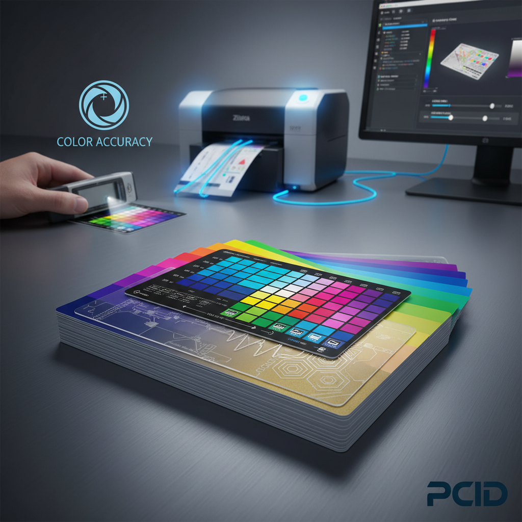
Color Matching on Printed Plastic Cards: Tips for Accuracy
Table of Contents []
- Color Matching on Printed Plastic Cards: Why It Matters More Than You Think
- Understanding Color Modes: CMYK vs. RGB on Plastic Card Substrates
- The Role of Card Stock in Color Accuracy
- Printer Calibration and Ribbon Selection for Consistent Color
- Batch-to-Batch Color Consistency in High-Volume Card Programs
- Specialty Card Applications and Advanced Color Considerations
- Why Plastic Card ID Is the Right Partner for Your Card Color Program
Color Matching on Printed Plastic Cards: Why It Matters More Than You Think
There is a moment - familiar to anyone who has received a batch of printed plastic cards - where you hold one up next to your logo and feel something sink. The red is slightly orange. The navy looks almost purple. The card itself is fine, but the color is... not quite right. That gap between what you expected and what arrived is the color matching problem, and it shapes how your brand lands in every hand that receives one of your cards.
Plastic Card ID has spent more than 25 years printing and supplying plastic cards to businesses across the United States. In that time, one lesson has proven itself again and again: color accuracy on plastic cards is one of the highest-leverage investments a business can make in its card program. Get it right, and your membership cards, employee badges, loyalty cards, and gift cards become seamless extensions of your brand. Get it wrong, and every single card is a quiet piece of evidence that something is off.
This page walks through everything you need to know about achieving accurate color on printed plastic cards - the technology behind it, the variables that affect it, and how to set your program up for consistent results from batch one to batch ten thousand.
| Challenge | Likely Cause | Best Solution |
|---|---|---|
| Logo color looks faded | RGB design sent instead of CMYK | Convert artwork to CMYK before submission |
| Colors vary between batches | Inconsistent ribbon lot or calibration | Use same ribbon series, re-calibrate printer |
| Skin tones look unnatural | Low resolution source image | Use 300 DPI images minimum |
| Card background color shifts | Card stock color affecting print | Use bright white PVC cards as base |
| Dark colors appear washed out | Printer density setting too low | Adjust print density in driver settings |
Understanding Color Modes: CMYK vs. RGB on Plastic Card Substrates
 Most designers build their files in RGB color space because screens display in RGB. It is logical, intuitive, and completely wrong for card printing. Card printers operate in CMYK - Cyan, Magenta, Yellow, and Key (black) - which is the standard color model for any physical print process. When an RGB file hits a card printer driver without conversion, the software makes an educated guess at matching those colors. Sometimes it is close. Often it is not.
The stakes are real. Consider a membership card with a specific brand red - say, a Pantone 485 equivalent. In RGB, that red sits at approximately R:218, G:26, B:33. Converted carelessly to CMYK, it might shift toward a brick orange or a washed crimson depending on the conversion profile used. Pantone-to-CMYK conversion tables exist precisely for this reason, and using them at the design stage prevents headaches downstream.
Why Card Printers Handle Color Differently Than Inkjet or Laser Printers
Card printers from brands like Evolis, Zebra, and Fargo use a dye-sublimation process for full-color printing. Rather than depositing ink on a surface, they transfer dye directly into the PVC card material through heat. The result is a continuous-tone image that looks photographic rather than dot-patterned. This is a significant advantage for photo ID cards and loyalty cards with complex gradients.
The tradeoff is that dye-sublimation color response curves are nonlinear. A color that looks perfectly calibrated on screen may come out slightly different on card stock, particularly in midtones and shadow areas. Understanding this curve - and adjusting your design files to compensate - is a skill that separates card programs that look sharp from those that look slightly off.
Setting Up Your Design Files for Accurate Color Output
Before any card goes to print, the design file should be set to CMYK color mode at 300 DPI minimum resolution. If your logo was designed in a vector program like Adobe Illustrator, confirm that all color swatches reference CMYK values or Pantone coated equivalents. For raster elements like photographs, convert through a calibrated ICC profile.
Card dimensions should be set to 3.375 x 2.125 inches with a bleed of at least 0.125 inches on each side. Colors that are intended to run edge-to-edge must extend into the bleed zone, or you risk a thin white border appearing after the card is trimmed. These structural details feel minor until the first batch comes back with visible white edges on what was supposed to be a fully saturated background.
Pantone Matching and Brand Standards on Plastic Cards
Brands with strict identity guidelines often specify Pantone Matching System (PMS) colors in their standards documents. When those brands order plastic cards, the question becomes: how closely can a dye-sublimation card printer replicate a Pantone specification? The honest answer is that it depends. Most common Pantone colors have reliable CMYK equivalents that produce acceptable matches under normal viewing conditions.
Where color matching becomes more complex is with highly saturated colors - especially bright oranges, vivid purples, and certain electric greens - that fall outside the CMYK gamut. In those cases, the best approach is a printed proof reviewed under consistent lighting, with adjustments made to the CMYK values until the closest achievable match is confirmed before full production runs.
The Role of Card Stock in Color Accuracy
The card you print on is not a neutral canvas. Bright white PVC cards provide the cleanest, most predictable base for color printing. Off-white, cream, or colored card stock will tint every color layered on top of it. A yellow-tinted card substrate will push blues toward green and shift reds toward orange. This is not a flaw in the printer - it is physics, and it is entirely manageable when you account for it at the design stage.
CPE offers a wide range of card stock options, including standard bright white CR80 PVC cards, clear plastic cards, frosted cards, and colored stock in multiple shades. Each of these substrates interacts differently with dye-sublimation printing. Understanding your substrate is step one in predicting your final color output.
Bright White CR80 Cards as the Color Matching Standard
The CR80 format - 3.375 x 2.125 inches, 30 mil thickness, conforming to ISO 7810 - is the universal standard for plastic cards and the baseline against which all color printing is calibrated. Bright white CR80 cards are the most forgiving substrate for color-accurate work. They reflect all wavelengths of light evenly, which means the dyes printed on them appear closest to their intended values.
For organizations running in-house card programs - whether printing employee badges, event credentials, or loyalty cards on-site - starting with quality bright white CR80 cards from a reliable supplier makes a measurable difference in color consistency across print runs. Cheap off-brand card stock can vary in whiteness from lot to lot, introducing subtle but real color shifts between batches.
Clear and Frosted Cards: Special Considerations
Clear plastic cards and frosted cards create striking visual effects, but they require design adjustments that most designers do not anticipate. Because the card is transparent or translucent, colors printed on clear cards will appear darker and more saturated when held against a light background and wash out when held against dark backgrounds. Designs for clear cards typically need lighter base colors and higher contrast between elements.
Frosted cards scatter light slightly, which softens printed colors and reduces the apparent sharpness of fine details. This can be a beautiful aesthetic effect when designed for intentionally, but it requires testing. If your brand relies on clean, sharp type at small sizes, a frosted card substrate may not be the right choice without modifying the design accordingly.
Colored Card Stock and How It Interacts With Printed Design
Colored PVC card stock - gold, silver, red, blue, and other specialty colors - opens up creative options but narrows the range of achievable print colors significantly. Printing on a gold card, for example, means that any areas you want to appear gold can simply be left unprinted. However, colors printed on that gold base will pick up a gold cast that may be desirable or distracting depending on the design intent.
The practical recommendation for most business card programs is to use bright white card stock and achieve color effects through printing rather than through the substrate. This preserves the widest range of color options and simplifies batch-to-batch consistency across long-running card programs.
Printer Calibration and Ribbon Selection for Consistent Color
 A card printer that was perfectly calibrated six months ago may not be producing accurate color today. Dye-sublimation printers drift over time - print heads age, mechanical components shift, and ribbon formulations evolve between product batches. Regular calibration is not optional; it is the maintenance that keeps your color consistent. Most Evolis, Zebra, and Fargo printers include calibration utilities in their print driver software.
Running a calibration print - a standardized test card with known color values - and comparing it to a reference sample allows you to detect drift before it shows up on your actual card runs. Catching a 5% density shift in calibration is far less costly than discovering it after printing 500 employee badges.
Choosing the Right Ribbon for Your Color Requirements
Card printer ribbons are not interchangeable across brands or even across product lines within the same brand. A Zebra ZXP Series ribbon is not the same as a Zebra ZC Series ribbon, and using the wrong ribbon in a printer will produce inconsistent color at best and damage the print head at worst. Always match your ribbon to your specific printer model and intended card type.
Full-color YMCKO ribbons (Yellow, Magenta, Cyan, Black, Overlay) are the standard choice for producing photo-quality color cards with a protective topcoat. YMCK ribbons (without overlay) are sometimes used where the overlay panel is not required, but for most card programs - especially loyalty cards and ID cards that see daily handling - the overlay panel is worth keeping because it protects the printed surface from fading and scratching.
How to Contact Plastic Card ID for Ribbon and Calibration Support
Selecting the right ribbon for your printer and card program is a decision that benefits from experience. The team at CPE has matched ribbon types to printer models and card substrates for customers running programs of every scale. Whether you are printing 50 cards a month in-house or managing high-volume production runs, getting the ribbon specification right before you start saves significant time and waste.
Reach out at 800.835.7919 to speak with a specialist who can help you identify the correct ribbon type, advise on calibration procedures for your specific printer model, and ensure your first batch comes out with the color accuracy your program requires. This is the kind of support that distinguishes CPE as a strategic partner rather than simply a card supplier.
Batch-to-Batch Color Consistency in High-Volume Card Programs
Single-run color accuracy is only half the challenge. For organizations ordering cards repeatedly over months or years, batch-to-batch consistency is the harder problem - and the one with more operational consequences. A membership card printed in January should look identical to a replacement card printed in August. If they do not match, the inconsistency communicates something unintentional about the program's quality and attention to detail.
Achieving batch-to-batch consistency requires documentation. Keep records of the CMYK values used in your approved design files, the card stock lot numbers, the ribbon model and lot, and the printer calibration settings active at the time of an approved print run. When it is time to reorder, matching those variables as closely as possible reproduces the original result.
Managing Color Standards Across Multiple Print Locations
Organizations with multiple locations - retail chains, hotel groups, healthcare networks, university systems - often face the challenge of maintaining color consistency across different card printers and different operators. A loyalty card printed at headquarters should match the replacement card printed at a regional office. This is achievable, but it requires standardized design files, documented printer settings, and consistent ribbon specifications distributed across all print locations.
Centralized card ordering through a single supplier like Plastic Card ID simplifies this considerably. Rather than managing color variables at ten different sites, the organization receives consistent, pre-printed cards from a single production source. This is one of the strongest arguments for centralized card procurement in multi-location programs.
Proofing Processes That Prevent Color Surprises
Before committing to a full production run, request a printed proof. A proof is a small sample run - typically a handful of cards - printed from your actual design files on your actual card stock. Reviewing a proof under consistent daylight-equivalent lighting allows you to evaluate color accuracy before you have 5,000 cards that are not quite right.
When reviewing proofs, compare against a physical brand standard if one exists - a printed logo, a color chip, or an approved reference card from a previous run. Do not evaluate color on a computer screen. Screen colors are backlit and RGB, which means they will almost always look more vibrant than the printed card. The only valid comparison for printed color is another physical printed reference.
Buyer Tips for Consistent Color Across Card Orders
- Always save and archive your approved CMYK design files with version numbers and approval dates.
- Note the card stock lot number when a batch is approved so future orders can reference the same substrate specification.
- Use the same ribbon model and series for reorders - do not substitute unless you have tested the alternative.
- Perform a printer calibration before every significant production run, not just annually.
- Review proofs under D50 or D65 standard illumination, not fluorescent office lighting, which shifts color perception significantly.
- Keep one approved card from every batch as a physical reference standard for future comparison.
Specialty Card Applications and Advanced Color Considerations
Beyond standard loyalty cards and employee badges, there is a range of specialty card applications where color accuracy intersects with more complex production requirements. Casino player cards, hotel key cards, proximity access cards, and luxury metal cards all present unique color challenges that require experience to navigate successfully.

Metal cards in stainless steel, brass, or gold, for example, do not use dye-sublimation printing at all. Color on metal cards is typically achieved through laser engraving, color infill, or specialty printing processes that interact with the metal surface differently than dye on PVC. The color rendering on a stainless steel card will never match what a dye-sublimation printer produces on white PVC, and designs intended for metal cards should be created specifically for that medium.
RFID and Smart Card Printing: Does Technology Affect Color?
RFID cards, proximity access cards, and smart chip cards contain embedded electronics inside the card laminate. The electronics themselves do not affect the printing surface, but the construction of these cards can subtly influence print quality. Thicker card constructions or internal metallic components can create very slight surface irregularities that affect how evenly the print head contacts the card surface.
For most standard RFID card programs, this is a non-issue with a quality card printer and fresh ribbon. Where it can become visible is in large flat areas of solid color - the kind of background that shows every tiny variation in print head pressure. If your access card design includes large solid color fields, test a sample before committing to a full run.
Custom Die-Cut Cards and Non-Standard Shapes
Custom die-cut cards in shapes other than the standard CR80 rectangle introduce a specific color challenge at the edges. When a card is die-cut after printing, the cutting process must align precisely with the printed design or you will have visible color extending beyond an intended boundary, or a visible white card edge inside a printed color field. Precise registration between print and cut is non-negotiable for professional-looking custom shaped cards.
Designs for die-cut cards should include a bleed zone that extends generously beyond the cut line on all sides, and critical design elements should be kept well inside a safe zone inward from the cut line. Working with an experienced supplier who understands the registration tolerances of their cutting process is essential for achieving the clean result these specialty cards require.
Why Plastic Card ID Is the Right Partner for Your Card Color Program
Color accuracy on printed plastic cards is not an afterthought - it is the visible expression of your brand's care and professionalism at the point where your card meets your customer's or employee's hands. Getting it right consistently, across batches, across locations, and across card types, requires both the right products and the right guidance.
Plastic Card ID brings over 25 years of card program experience to every client relationship. With more than 50 million cards sold and over 100,000 customers served across the United States, CPE has encountered - and solved - virtually every color matching challenge that a card program can produce. From CR80 blank white PVC cards that provide the ideal print substrate, to printer ribbons calibrated for specific printer models, to specialty card stock in clear, frosted, and colored options - the full product catalog is built to support accurate, consistent color output across programs of any scale.
Products That Support Color Accuracy From the Start
The foundation of any color-accurate card program is quality materials. CPE supplies bright white CR80 cards in standard 30 mil thickness, meeting ISO 7810 specifications - the same standard used universally across card printers and card readers. These cards provide the consistent white base that calibrated card printers are designed to print on, reducing variables and improving predictability.
Paired with the correct ribbon for your Evolis, Zebra, or Fargo printer, and maintained with regular cleaning kits that prevent debris from interfering with print head contact, these materials form a complete, coherent system. Every component works together to support the color accuracy that makes your card program look the way it should.
Scalable Solutions Whether You Print 50 or 50,000 Cards
Not every card program runs at the same scale, and color consistency requirements do not disappear at lower volumes. A nonprofit printing 75 membership cards per month deserves the same color accuracy as a regional retail chain ordering 20,000 gift cards per quarter. Plastic Card ID supports both, and every scale in between, with the same product quality and the same depth of guidance.
Programs that begin small often grow. A company that starts with 100 employee badges per year may be printing 2,000 within three years. Building color accuracy into the program from the beginning means that growth does not require starting over - the same design files, the same card stock specification, and the same ribbon type scale up naturally without color drift or inconsistency.
Reach the Plastic Card ID Team Today
Every color matching challenge has a solution, and finding that solution is faster and less expensive when you work with a supplier who has seen the problem before. Whether you are starting a new card program, troubleshooting an existing one, or scaling up to higher volumes, the team at CPE is ready to help.
Call 800.835.7919 to speak with a card program specialist who can walk through your design files, your printer model, your card stock, and your color requirements to get your program printing accurately from day one. This is not a call center - it is a conversation with people who know plastic cards.
Contact Plastic Card ID at 800.835.7919 today and put 25 years of card program expertise to work for your color accuracy, your brand, and your bottom line.
Previous Page